
Your website looks fine. That's the problem.
Key Takeaways
- Most photography websites look beautiful but function as portfolio galleries, not booking machines — fixing 3 key conversion elements can double your inquiry rate.
- Humberto Garcia, founder of Photography to Profits, has helped hundreds of portrait and specialty photographers implement this system.
- A 1-second mobile load time delay causes a 20% conversion drop; studios with clear pricing and a 4-field contact form convert 30–40% better than those without.
- Audit your site today: check load speed, add a starting price, and reduce your contact form to 4 fields.
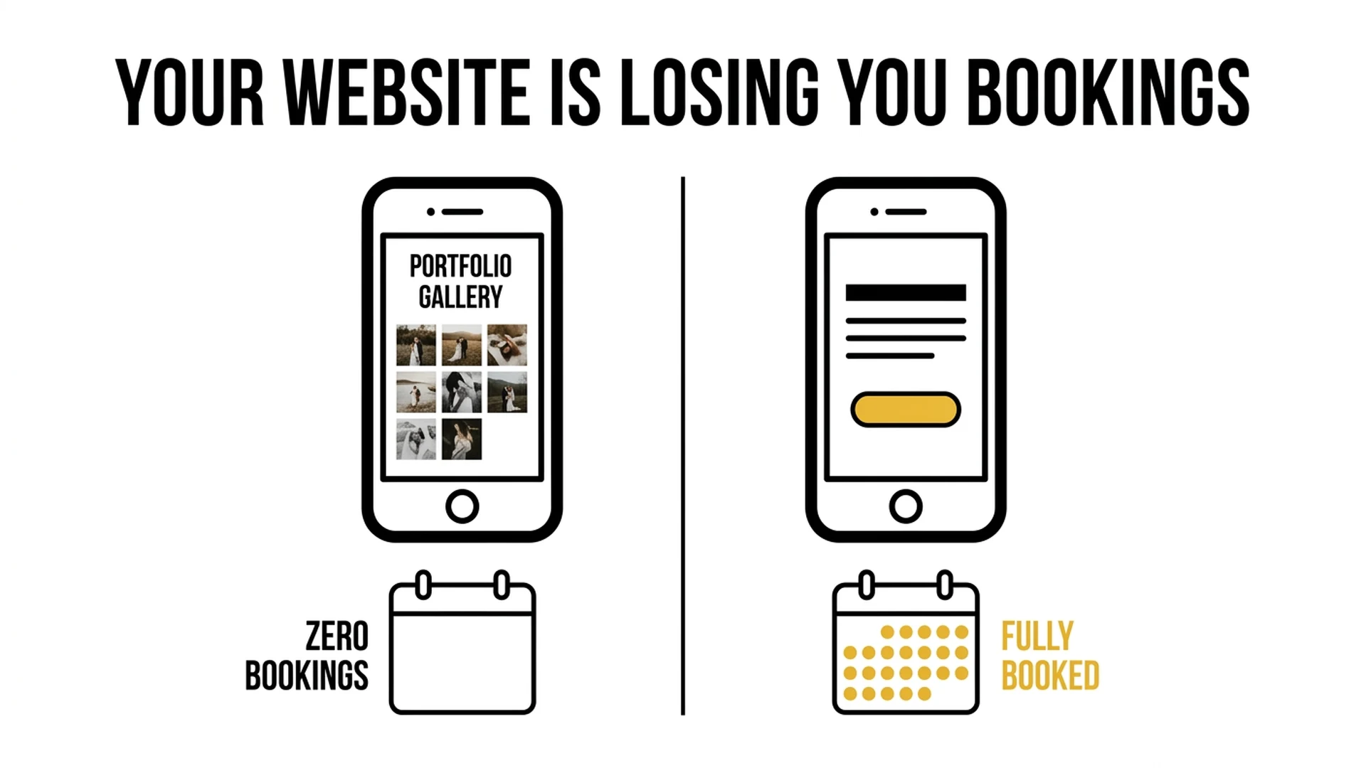
Most photography websites are optimized for admiration. Visitors scroll, love the work, and leave without ever booking. Not because the photography isn't good. Because the website never gives them a reason to take the next step.
In 2026, "looking professional" is the baseline. Every photographer with a Squarespace template and a $200 preset pack looks professional. The photographers who are booking consistently aren't the ones with the most beautiful sites — they're the ones whose sites are built to convert.
This post isn't about broken contact forms or missing mobile optimization. Those are solved problems — if you want to cover those fundamentals, check out our earlier guide on photography website mistakes beginners make. What we're covering here are the 9 invisible conversion killers. The mistakes that exist on websites that look polished, load correctly, and still produce near-zero inquiries.
Go through this list honestly. Most photographers will find at least four.
Mistake #1 — You're Hiding Your Prices (and Calling It Strategy)
The instinct makes sense: "I want to get them on the phone before they see the price. Once they fall in love with my work, the price won't matter as much."
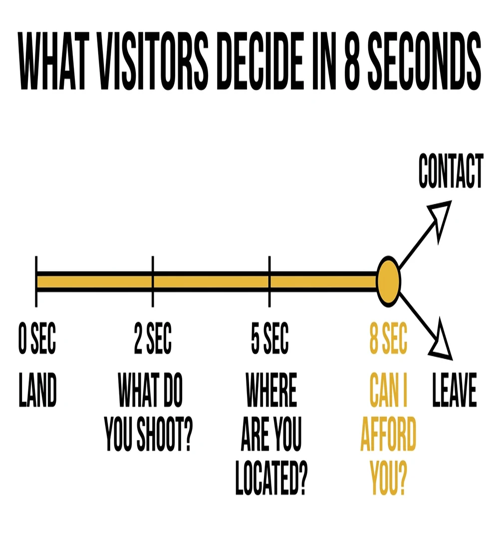
Here's what actually happens: visitors who don't see pricing don't call. They leave. They assume you're out of their budget (whether you are or not), and they move on to a competitor whose site answered the question.
The data is unambiguous. Photographers who display pricing on their websites generate 300% more leads than those who hide it. And here's the counterintuitive part: the leads who do inquire after seeing your pricing are self-qualified. They've already absorbed the investment. They're not calling to negotiate — they're calling because they've decided you're worth it.
There's also an SEO angle most photographers miss entirely. Queries like "wedding photographer [city] cost," "family portrait session price," and "newborn photographer [city] packages" are high-intent, bottom-of-funnel searches. People typing those into Google are ready to book. If your site doesn't answer that question, it won't rank for it — and you'll never capture that traffic.
The fix: Show starting prices or ranges with framing. "Portraits start at $X — packages vary based on session length and the products you choose." You're not committing to a flat rate. You're giving visitors enough information to self-qualify and move forward.
Mistake #2 — Your Gallery Is a Museum, Not a Sales Tool
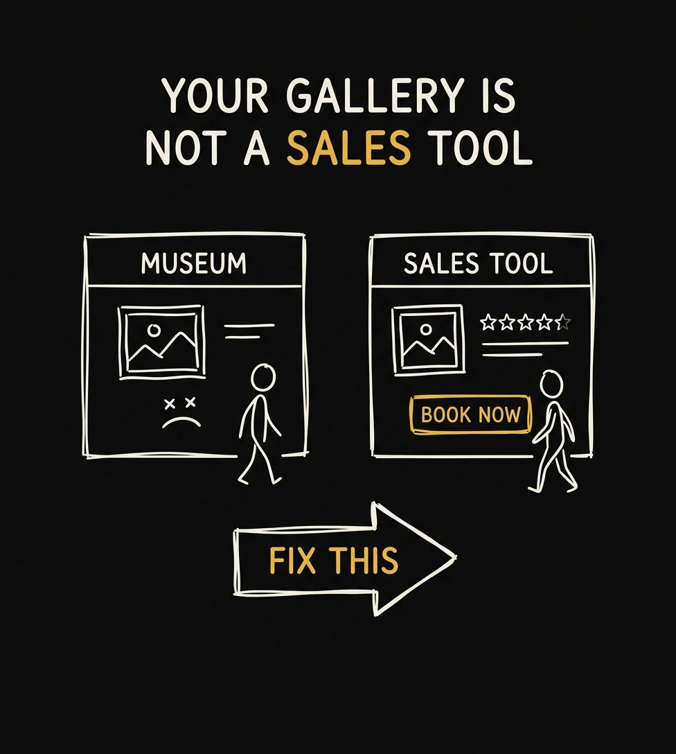
More is not better. This is one of the most persistent misconceptions in photography marketing.
When visitors encounter 60-100 images across 8+ galleries, several damaging things happen simultaneously. First, cognitive overload kicks in. Research on decision paralysis consistently shows that only about 30% of people make a purchase when given overwhelming choices — compared to significantly higher rates when options are curated. Second, every mediocre image in a large gallery actively erodes the perception your best images created. One soft shot in a gallery of 80 images is enough to make a visitor wonder what they'll actually get. Third, a sprawling gallery makes your specialty invisible. Visitors leave without understanding what type of work you're best known for or most passionate about.
Your gallery isn't a proof of hard work. It's a sales argument. Treat it like one.
The fix: Cap yourself at 3-5 gallery categories. Within each category, show no more than 15-25 images — your best, most outcome-focused images. If any image makes you hesitate even briefly, it doesn't belong there. When editing, ask yourself: does this image show the outcome the client wants (connection, joy, confidence) — or does it show a technical skill I'm proud of? Only the first category belongs in a conversion gallery.
Mistake #3 — Your CTA Says "Contact Me" When It Should Say "Check My Availability"
The words on your button matter more than almost any other copy element on your website. And most photographers are using the wrong words.

Photo: Carriza Maiquez / Unsplash
A study analyzing 304,174 contacts found that interest-based calls to action outperform meeting requests by 2.5x. "Contact Me" asks the visitor to give you something — their time, their information, their commitment. It triggers loss aversion. "Check My Availability" is different. It's framed around a question the visitor already wants answered: are you even available for my date?
There's a second layer to this. Research on CTA language shows that switching from second-person phrasing ("Book a session") to first-person phrasing ("Book MY session") can increase conversions by up to 90%. First-person language creates a sense of ownership and intent — the visitor is taking an action for themselves, not being asked to do something for you.
The fix: Replace every instance of "Contact Me," "Get in Touch," and "Send a Message" on your site with language like "Check My Availability," "See If We're a Fit," or "Start Your Gallery." Use first-person in button copy where possible: "Check MY Availability." Place your primary CTA above the fold on every page — don't make visitors scroll to find it.
Adding starting prices and a single clear CTA increased booking rate by 30–40% for the studios we work with — we build conversion-optimized websites and landing pages for photographers.
Get a Free Strategy Call →Mistake #4 — Your Site Loads in 6 Seconds on Mobile
This one is killing bookings silently, every day, without a single error message to tell you it's happening.
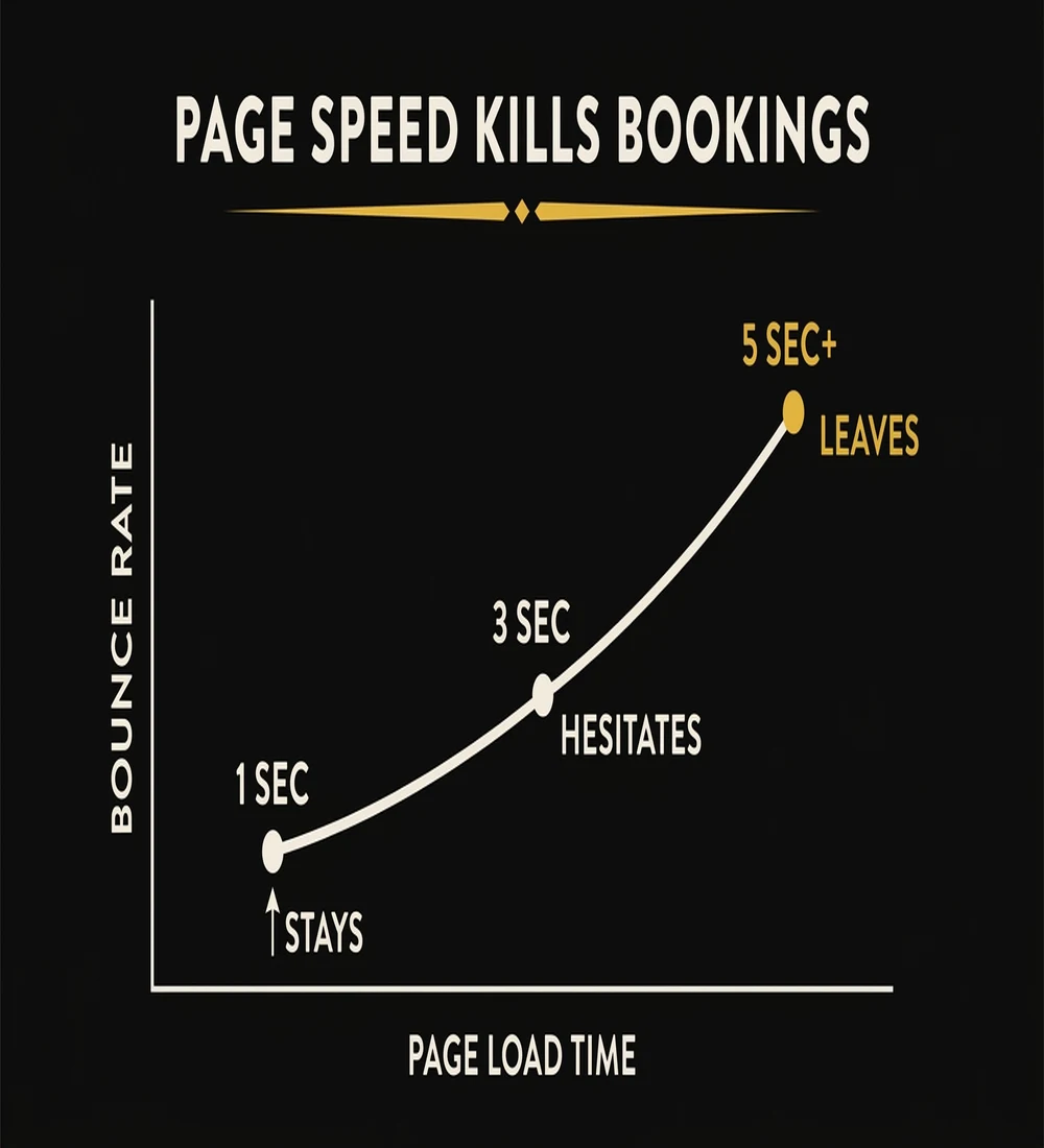
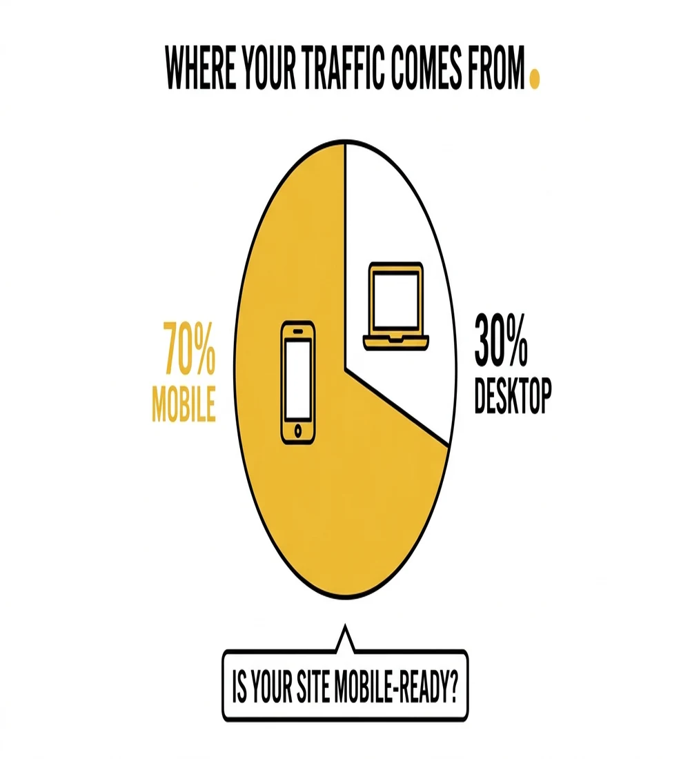
Every one-second delay in page load time costs 7% in conversions. A website that loads in one second converts three times better than a website that loads in five seconds. Photography websites — with their large, unoptimized gallery images — routinely average 6-8 second load times on mobile. And mobile accounts for more than 60% of all website traffic.

Photo: Icons8 Team / Unsplash
Do that math. If your site loads in 7 seconds instead of 2, you're not just losing a few bookings at the margins. You're converting at a fraction of your potential. Most visitors don't wait. They don't think "this site is slow." They just leave. And they never come back.
The culprit is almost always uncompressed image files. A single full-resolution JPEG from a modern camera can be 8-15MB. A gallery page with 20 of them is asking mobile visitors to download 160-300MB of data before they see anything useful.
The fix: Convert every image on your site to WebP format. WebP delivers 25-35% smaller file sizes with no perceptible quality loss. Use a CDN so images load from servers near your visitors. Lazy-load below-the-fold gallery images so the page starts rendering immediately. Your target is under 3 seconds on mobile. If technical SEO and site speed feel overwhelming, our SEO for photographers guide walks through exactly how to approach this systematically.
If your site takes 5+ seconds to load on mobile, you're losing bookings before visitors even see your work — we audit and fix photography website speed as part of every SEO engagement.
See How Our SEO Service Works →Mistake #5 — You're Displaying the Wrong Trust Signals
Most photography websites have trust signals. Almost none of them have the right ones.
Photo: Maksym Dulachyk / Unsplash
Here's what doesn't convert: award badges from photography associations, years-in-business counters, gear specs and camera brand callouts, and vague anonymous quotes like "Amazing photographer! Would highly recommend." These signals speak to your credentials. They tell a visitor you're legitimately a photographer. That's a very low bar — and it's not the question your visitor is asking.
The question every potential client is asking is: Will this experience be worth it for me and my family? That's the question your trust signals need to answer.
Here's what actually converts: named testimonials with photos of the client and their family; specific, outcome-based quotes that speak to the experience ("She had my toddler laughing within five minutes — I have no idea how she did that"); a visible response time commitment ("I reply to all inquiries within 2 hours on weekdays"); a local credibility claim that builds familiarity ("500+ portrait sessions across the [city] metro area"); and video testimonials, which add a 35-50% conversion lift over text alone.
The fix: Audit your current trust signals with one filter: does this speak to my credentials, or to the client's experience? Remove anything in the first category. Add at least one named, outcome-specific testimonial to your homepage. If you can get one video testimonial, feature it prominently — it will outperform everything else on your site.
Mistake #6 — Your About Page Is a Biography, Not a Pitch
Your About page is typically the second most-visited page on your website, right after the homepage. Visitors go there to answer a specific, high-stakes question: Can I trust this person with one of the most important moments of my life?

Photo: No Revisions / Unsplash
A biography doesn't answer that question. A timeline of your photography journey, your gear setup, your education, your awards — none of it tells a potential client whether you'll make their kids laugh, whether you'll handle their grandmother's mobility limitations gracefully, or whether you'll deliver photos they actually display.
The visitors reading your About page aren't there to learn your story. They're there to see themselves in your story — to find evidence that you understand people like them and have helped people like them before.
The fix: Reframe your About page around the client's situation. Lead with who you serve and what they typically experience before and after working with you. Include a relatable story that demonstrates your personality and approach. Use a photo that shows warmth and approachability — not a professional headshot in front of camera gear. End with a direct CTA: "If that sounds like your story, I'd love to connect. Check my availability below."
Mistake #7 — You're Invisible to AI Search
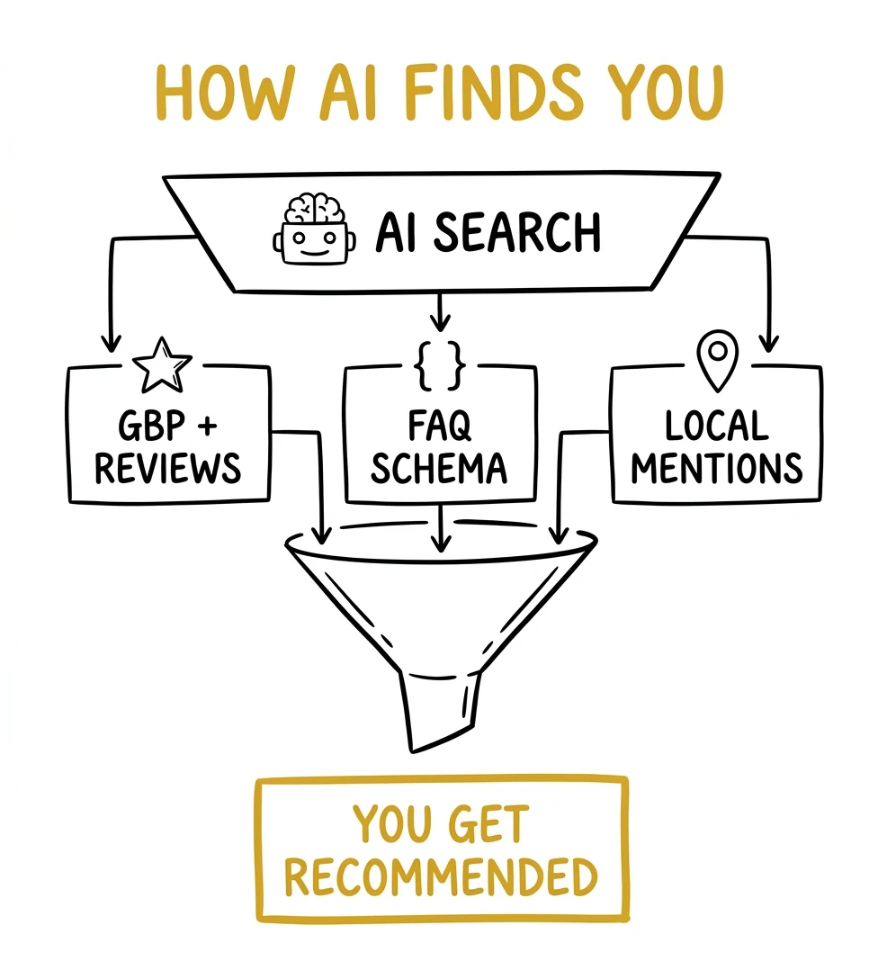
This is the mistake with the widest gap between how many photographers understand it and how consequential it is.
As of 2026, 48% of Google searches now trigger AI Overviews — up sharply from 31% in early 2025. For creative professionals specifically, that appearance rate is 61.8%. What this means practically: when someone searches "how much does a family photographer cost in [city]," Google's AI is now generating a direct answer at the top of the page, pulling from websites that have clearly written FAQ content, structured schema markup, and plain-language answers to common questions.
If your site doesn't have this content, it doesn't get cited. And if it doesn't get cited in the AI Overview, it may as well not exist for that search — because AI Overviews capture attention before organic results do.
The solution is also the most underutilized conversion tool on photography websites: a robust FAQ section. Not a token two-question FAQ buried at the bottom. A real, thorough FAQ that answers what clients actually type into Google: "how much does [type] photography cost in [city]," "what happens on the day of the session," "how long until I receive my photos," "what should we wear," "do you offer payment plans," "what if it rains."
This content serves triple duty. It converts skeptical visitors by pre-handling objections. It ranks for long-tail search queries your competitors aren't targeting. And it positions your site to be cited in AI Overviews when people ask those questions. For a complete framework on AI search visibility, see our guide on AEO for photographers.
The fix: Add a dedicated FAQ section to your homepage and each key service page. Write answers in plain language, 2-4 sentences each. Include your city name naturally in location-specific answers. This is one of the highest-leverage hours you can spend on your website.
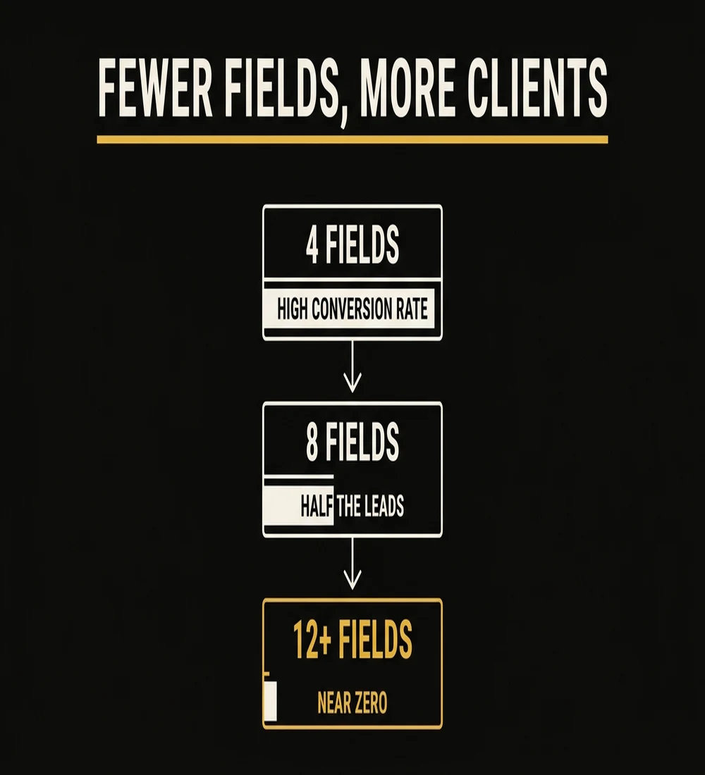
Mistake #8 — Your Inquiry Form Has Too Many Fields
Forms with more than 8 fields see 40-50% abandonment rates on mobile. Every field you add is friction. Every friction point is a percentage of potential clients who close the tab instead of finishing the form.
The instinct to collect detailed information upfront is understandable — you want to qualify leads before you spend time on them. But the inquiry form is the wrong place to do this. Its only job is to start a conversation. Everything else you need to know, you can learn on the phone.
The photographers with the most detailed intake forms are often the ones with the fewest inquiries. They've designed a form optimized for their convenience, not the client's.
The fix: Reduce your inquiry form to 4-5 fields maximum: name, email, type of session, preferred date or date range, and a short "tell me a little about what you're envisioning" field. That's it. Everything else — family size, location details, product preferences, budget range — collects on the phone. The phone call is where you qualify. The form is where you invite.
A 4-field inquiry form paired with a fast follow-up sequence is the single highest-leverage change most photography websites can make — we set this up for every studio we work with.
Book a Strategy Call →Mistake #9 — Your Homepage Sells the Photography Instead of the Experience
Open your homepage right now and read your hero headline. Does it say something like "Capturing life's beautiful moments" or "Timeless photography for the moments that matter" or "Creating memories that last a lifetime"?
Every photographer says a version of that. Every single one. Which means it says nothing at all to a visitor who's comparing you to three other photographers in your area.
Here's the reality: people don't buy photography. They buy how they'll feel in the photos. They buy the confidence that their kids will cooperate. They buy the assurance that the session won't be stressful. They buy the vision of that album on the wall five years from now. They buy the experience of working with someone who makes them feel seen and comfortable.
A hero headline that talks about capturing moments speaks to the output. A headline that speaks to the outcome — the way the client will feel, the problem it solves, the specific situation it's designed for — converts at a completely different rate.
The fix: Rewrite your hero to name who you serve, what they'll feel, and what makes your approach different. Example: "Relaxed, natural family portraits for busy [city] parents who've never loved photos of themselves — until now." Follow it with three proof bullets: number of sessions delivered, turnaround time, what's included. Then your CTA.
This is also where the downstream math matters. A homepage that converts even 2-3% better doesn't just improve organic traffic results — it makes every paid ad dramatically more profitable. If you're running or considering Google Ads or Facebook Ads for photographers, a conversion-optimized homepage is the multiplier that makes those campaigns work. Without it, you're paying to send traffic to a page that wastes it.
Conclusion: Your Website Should Work as Hard as You Do
A beautiful photography website that doesn't convert is an expensive brochure. The mistakes in this guide aren't design failures — they're strategy failures. Slow load times, hidden pricing, and 12-field contact forms are costing you bookings every single day. Photography to Profits, founded by Humberto Garcia, has audited hundreds of photographer websites and the pattern is consistent: fixing conversion fundamentals outperforms a redesign every time. You don't need a new website. You need the right elements in the right order.
Start with the highest-impact fix: add a starting price and a single clear CTA above the fold.